

Maroon Brew Co: Brewing Up a Mark Made for Collierville
Maroon Brew Co. is a family-friendly brewery and brewpub with deep roots in Collierville, Tennessee. From its locally inspired beer names to its community-focused taproom, Maroon Brew was built to feel unmistakably connected to the town it calls home.
When the Maroon Brew team needed an emblem that could extend their identity beyond the taproom, they turned to Team Sauce. Our job was to create a distinctive, merchandise-ready mark that brought together two things at the heart of the brand: Collierville and craft beer.
The Problem
Creating something that felt local—not generic.
Maroon Brew already had a name and visual identity rooted in Collierville. What they needed was an additional emblem that could stand on its own, particularly on merchandise, while still feeling unmistakably connected to the brewery.
A typical beer badge wouldn’t do. The new mark needed to feel authentic to Maroon Brew, recognizable to locals, and versatile enough to look just as good on a shirt or hat as it would alongside the rest of the brand.
The Goal
Turn Collierville icons into a Maroon Brew icon.
Our goal was to design an emblem-style logo that captured the brewery’s hometown personality in one memorable mark.
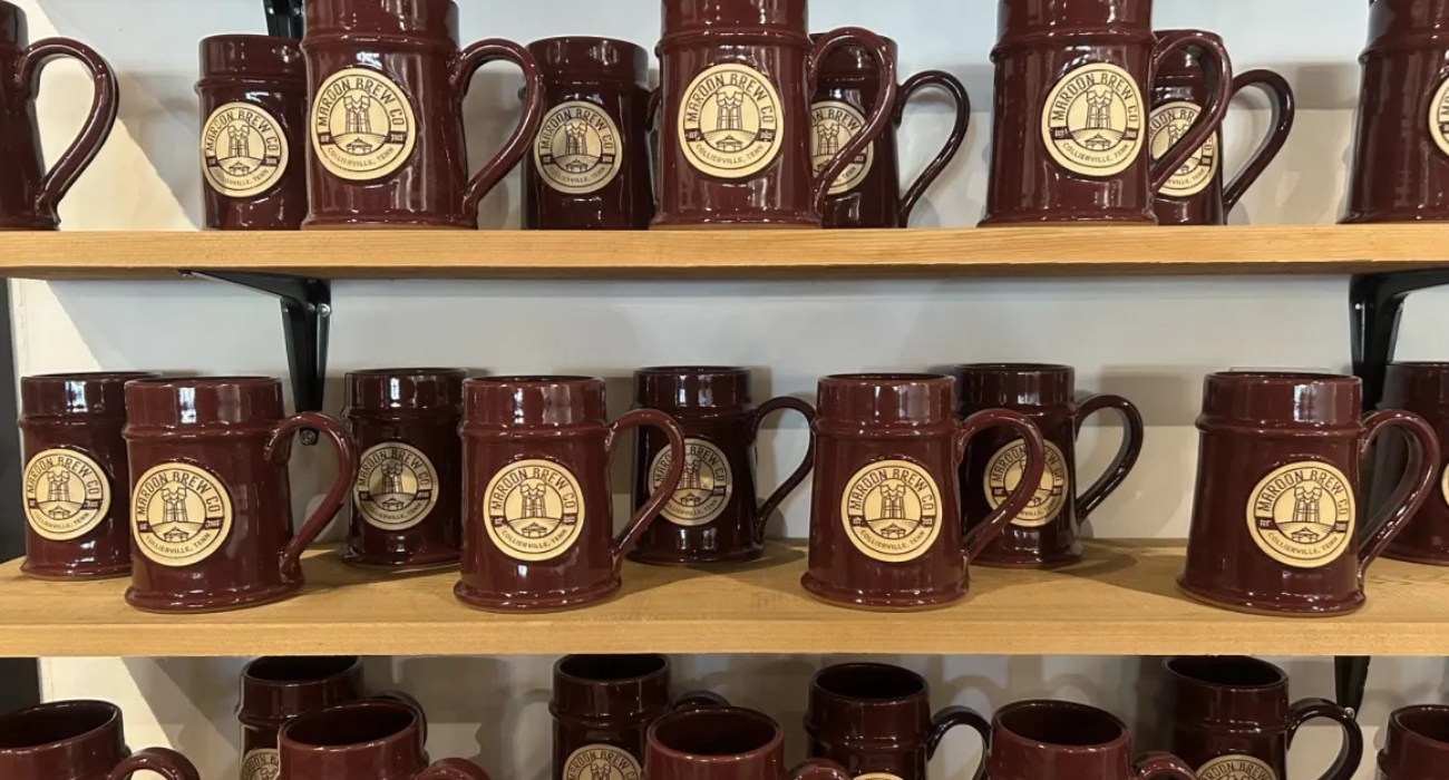
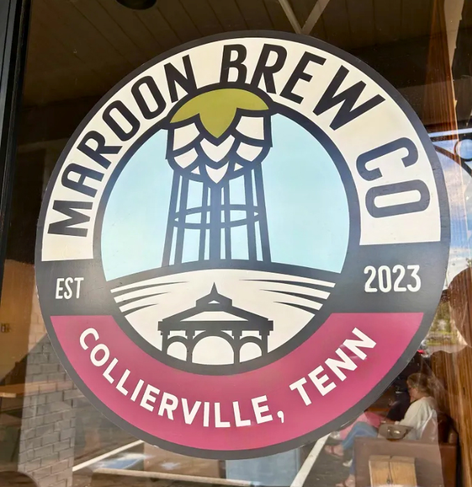
We drew inspiration from two of Collierville’s most recognizable landmarks—the historic Town Square gazebo and iconic water tower—reimagining them through the lens of Maroon Brew and incorporating hop-inspired details. Framed within a seal-like emblem, the finished design has the timeless, collectible quality of a brewery patch while remaining uniquely tied to Collierville.
The mark was designed with merchandise in mind, giving Maroon Brew a flexible graphic that could translate naturally across apparel and other branded pieces.
The Results
A hometown emblem made to be worn.
The finished emblem gives Maroon Brew a distinctive piece of its visual identity that feels equal parts brewery badge and Collierville pride.
Since its creation, the design has made its way onto Maroon Brew merchandise, giving customers another way to represent a brewery—and a community—they love.
Alongside the emblem, Maroon Brew’s clean name treatment carries the brand across its everyday touchpoints, including its website and signage within the brewery. Together, the elements create a visual presence that feels approachable, recognizable, and right at home in Collierville.
Sometimes the best brand marks don’t need to say everything. They just need to say exactly where you belong.
Graphic Design • Logo Design • Merchandise Branding
Connect With a Certified Growth Guide
Request your risk-free connect call with a Certified Growth Guide today.